- Published on
How to build consistent User Experience at scale
- Authors

- Name
- Parminder Singh
Consistent design is the invisible thread that weaves together usability, user experience (UX), and branding, creating an impactful product. Of course there can be situations where you need to break the consistency, but that should be a conscious decision.
In this article, we will discuss Why consistency is important, how to achieve it and discuss some processes and scaling these processes.
Why
Consistency builds user trust, boosts brand recognition, and creates effortless experiences that delight.

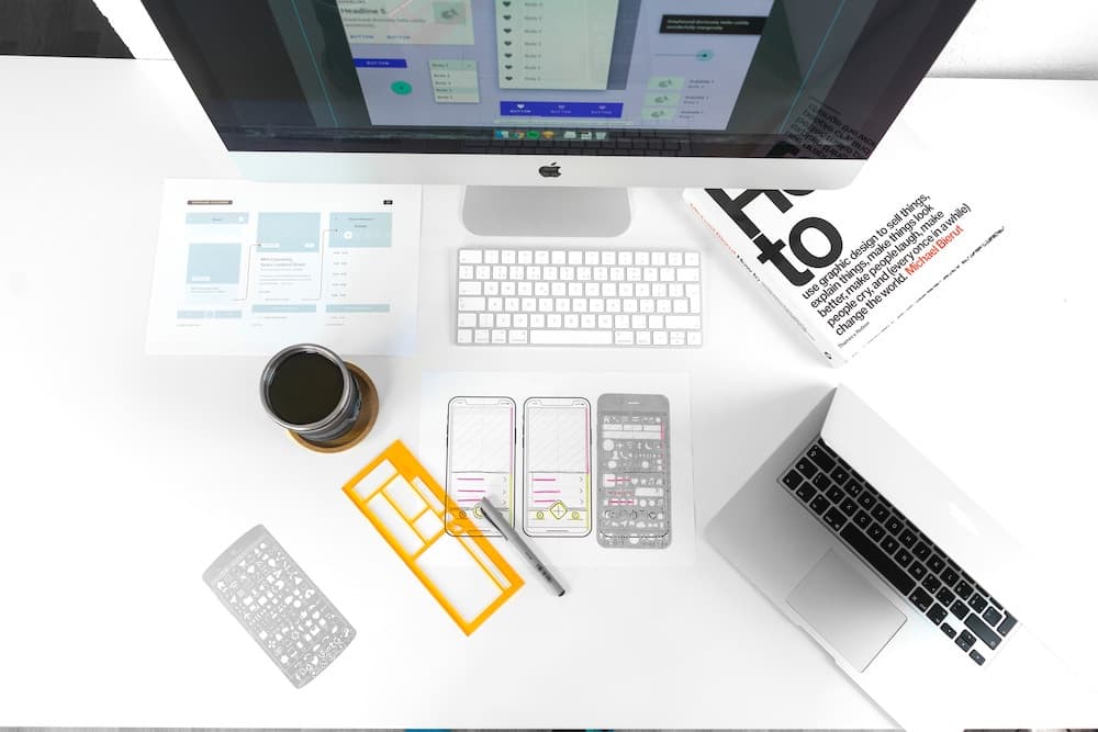
Photo by Karl Solano on Unsplash
1. Usability
Reduced Learning Curve
When elements look and behave consistently, users don’t have to relearn basic interactions each time they encounter a new feature. This reduces cognitive load and increases efficiency, making your product easier to use and learn.
Predictability and Familiarity
Consistent design creates a sense of predictability, allowing users to navigate your product with confidence. They know where to find things, how elements will behave, and what to expect based on their past experiences. This predictability fosters trust and reduces frustration.
Reduced Errors
Consistent design minimizes the chances of users making mistakes due to confusion or unexpected behavior. Users won’t accidentally click the wrong button or enter information in the wrong format because elements consistently follow established patterns.
2. User Experience
Enhanced User Satisfaction
Consistency contributes to a smooth and enjoyable user experience. Users appreciate the intuitiveness and logic that comes from a well-defined design system. This satisfaction translates into loyalty and positive brand perception.
Emotional Connection
A consistent design creates a sense of unity and cohesiveness, making your product feel polished and reliable. This fosters an emotional connection with users, strengthening their engagement and brand affinity.
Memorable Interface
Consistent design elements like logos, colors, and typography leave a lasting impression on users. This brand recognition makes your product memorable and easily stands out from the competition.
3. Branding
Strong Brand Identity
Consistency reinforces your brand identity, ensuring all interactions with your product reflect your core values and personality. This clarity strengthens brand recognition and differentiation, making your product stand out.
Professional Image
A well-defined design system conveys professionalism and attention to detail, building trust and confidence in your brand. This is especially important when your product is complex or has a high price point.
Scalability and Efficiency
A consistent design system facilitates efficient future development and product expansion. New features and updates can be integrated seamlessly, maintaining brand consistency and user familiarity.
How
Here are some tools and practices to build a solid UX foundation.

1. Design Systems
A design system is a centralized repository for design elements — a single source of truth for reusable components, patterns, and guidelines that define the visual language of your product. It ensures consistency across all interfaces and helps you scale your product efficiently. Imagine it as a construction kit for UI developers, ensuring every button, icon, and text box follows the same blueprint. This consistency breeds familiarity, minimizes cognitive load, and builds trust with users. Think of giants like Material Design or IBM Carbon — those are design systems in action, shaping consistent experiences across platforms and devices.
Creating your own design system can be daunting, but a custom design system reflects your brand’s unique personality, boosts development efficiency, and empowers your team to build cohesive experiences that delight users at every turn. One of the ways to start building a design system is to take an existing design system and customize it to your needs.
Checkout designsystems.com for inspiration here and here.
2. Style Guides
A style guide is a comprehensive documentation of design rules which define visual language, typography, colors, spacing, iconography, and other UI elements. This precision ensures user interfaces aren’t just assembled correctly, but also feel harmonious and familiar.
The style guide extends the design system. It delves deeper, offering voice and tone guidelines, accessibility best practices, and even micro-interaction details. Whether it’s the precise hover animation on a button or the playful error message tone, the style guide imbues the design system with personality and delight. In essence, it’s the final polish that transforms a functional interface into a truly engaging and memorable experience.
3. Component Libraries & UI Frameworks
A component library is a collection of reusable UI components that can be used to build interfaces. It ensures consistency across interfaces and facilitates efficient development. It is an extension of your design system that puts power in the hands of designers and developers. Each component, from buttons to forms, embodies the principles and styles defined in the design system. Think of them as lego bricks built to your brand’s specifications, ensuring every page feels like part of the same cohesive whole.
This curated collection eliminates the need to reinvent the wheel. Developers grab pre-tested, pixel-perfect components, drastically speeding up development. Designers wield familiar building blocks, ensuring UI consistency across even the most intricate screens.
UI frameworks provide structure and tools for building interfaces. They provide a solid foundation for consistent layout and styling. UI frameworks don’t define the aesthetics or details, but provide the structural foundation for consistent architecture and functionality. The underlying structure subconsciously influences the user experience by fostering consistency and predictability.
Depending on the design system, technology stack and other factors, there are various choices.
ReactJS: Material UI, Ant Design, React Bootstrap, etc.
Vue.js: Prime Vue, Veautify, etc.
Angular: Angular Material, ng-bootstrap, Kendo UI [Commercial], etc.
ReactNative: React Native Elements, React Native Paper, etc.

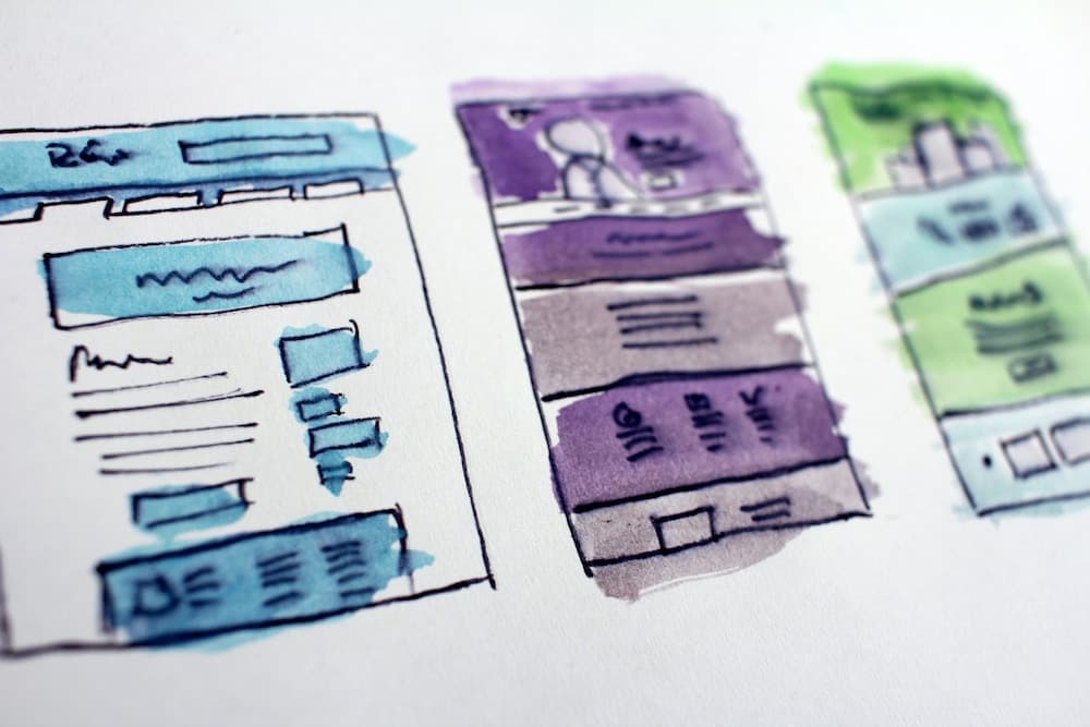
Photo by Hal Gatewood on Unsplash
5. Storybook
In my experience, Storybook is one of most powerful tools in the design toolchain. Building components iteratively, documenting component properties/options, showcasing examples, documenting edge cases, generating UIs, tracking history are just some of the capabilities of Storybook.
When implementing storybook, it is important to clearly define what the purpose of storybook is and what goes in the storybook. One of the pitfalls I’ve seen is going down the rabit hole and trying to document everything in the storybook and spending more effort than is required to maintain the component library. I have found success by clearly defining the following process around it.
- State the purpose. E.g. Document reusable components
- Define component categories. E.g. core components (input fields, labels, grids, etc.), utility components (date labels, HTML labels, etc.)
- Keep business logic out. There could be common reusable components that are used across screens that contain business logic. I prefer keeping these out of the storybook.
- Publishing & Versioning. I recommend publishing your component library as a node package. By doing this you get versioning automatically all the advantages there of.
- Project Management. Treat component library as a (platform) project. Have a ticketing system and a well-defined release cycle.
Processes
A solid process around reviewing and publishing will allow you to affect UX changes at scale.

Photo by David Travis on Unsplash
1. Design Reviews
Design reviews ensure consistency across interfaces. They help you identify inconsistencies and gaps between implementation and design. Design reviews also gather insights from multiple stakeholders, including designers, developers, product managers, and even potential users. This set of views can uncover issues and feed into the design system as improvements.
Checklists provide a clear roadmap, ensuring reviewers cover all essential aspects, from visual consistency to accessibility. This structure makes reviews more focused and efficient, saving time and resources. Enhancing Objectivity: By relying on a predetermined set of criteria, checklists reduce the risk of biases or personal preferences influencing reviews. This objectivity leads to more consistent and impartial feedback.
I will publish a detailed article on design reviews later but here’s a quick checklist for starters. This list goes beyond design and is far from comprehensive.
- Is the design consistent with the design system: Typography, Fonts, Colors, Spacing, Icons, Layout, Animations, Micro-interactions
- Does the screen work for different themes (E.g. dark/light) supported by the design system?
- Are empty data states handled?
- Are error states handled?
- Does the screen support large amounts of data?
- Is internationalization supported?
- Is accessibility supported?
- Does the screen work across supported resolutions?
- Are any custom components being used?
- Does the screen work across supported devices/browsers?
2. Automating Design Reviews
Automating design reviews can help you scale your product efficiently. It ensures consistency across interfaces and frees up resources for more strategic tasks. It also reduces the risk of human error, ensuring interfaces are reviewed thoroughly and consistently. Fully automating design and UX reviews isn’t yet feasible due to the subjective nature of design and user experience, here are a few tools that can automate parts of the process.
- Design System Compliance Checks: ZeroHeight, Frontify, Invision DSM
- Visual Regression Testing: Percy, Applitools
- Accessibility Testing: Axe, WAVE, accessiBe
- Code Linting and Formatting: ESLint, StyleLint
- Prototype and User Flow Testing: Maze, UserLytics
3. Design Task Intake, User Research & Feedback
It is important to have a formal process to intake requests for design work. A checklist or a questionnaire can help you gather all the information you need to get started and also force the requester to think through the problem they are trying to solve. These inputs in conjunction with user research can help shape the product more efficiently. Along with this, it is also important to incorporate user feedback gathering into your design process and the product.
dscout and User Testing are couple of tools that can help you for user research. For adding feedback, look at jam.dev.
Scaling
One way to scale design practice across teams is to think about Design as a management function. It requires ongoing investment and sponsorship from both leadership and individual teams. Some pointers below.
- Appoint a team dedicated to managing the system, ensuring consistency, quality, and evolution.
- Encourage cross-team collaboration, communication, input and feedback loop.
- Facilitate knowledge sharing and alignment across teams.
- Identify individuals across teams to promote the system and assist with adoption.
- Provide comprehensive training for new team members on using the system.
- Measure adoption rates and impact on design consistency and productivity.
- Balance consistency with the need to adapt the system to specific product needs.
Summary & Takeaways
Consistency is the foundation of a great user experience. It builds trust, familiarity, and predictability, making your product easier to use and remember. It also strengthens your brand identity, ensuring every interaction reflects your core values and personality. A solid design system & design practice facilitates efficient development and product expansion, allowing you to scale your product efficiently. Some action items to get started.
Define:
- Brand guidelines and design principles
- Core components and patterns
Build:
- Create a central repository (e.g., Storybook)
- Develop detailed documentation and usage guides
- Find inspiration on design systems. [1, 2]
Empower:
- Train teams on using the system
- Foster collaboration and feedback
Maintain:
- Continuously iterate and update the system
- Track adoption and measure impact
- Leverage automation tools for code linting, visual regression testing, and accessibility checks.
Let me know your thoughts.